How to Choose Office Furniture Colors That Boost Productivity and Reflect Your Brand
TL; DR – What You’ll Learn in This Guide
If you only have 60 seconds, here’s the bottom line:
Colors in your executive office furniture directly impact productivity and brand perception:
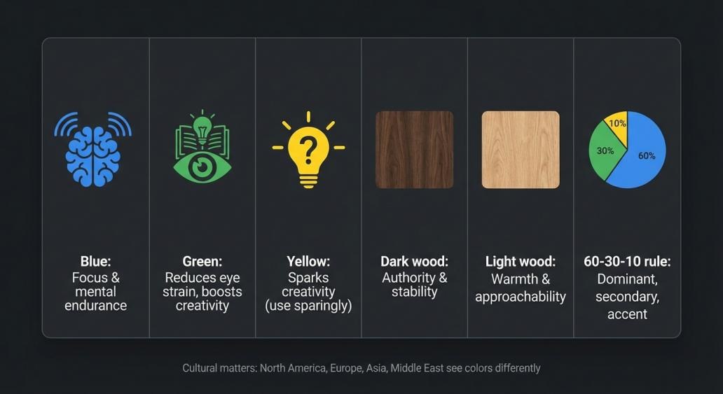
- Blueboosts focus and mental endurance – perfect for financial and legal executives
- Greenreduces eye strain and increases creative output – ideal for long work hours
- Yellowsparks creativity but use sparingly – best for brainstorming zones
- Dark woodconveys authority and stability – the classic choice for client-facing offices
- Light woodcreates warmth and approachability – great for collaborative leaders
The 60-30-10 rule works: 60% dominant color (walls, main desk), 30% secondary (cabinets, chairs), 10% accent (art, accessories).
Cultural matters: North Americans prefer neutrals and natural wood; Europeans lean toward light woods (North) or rich tones (South); Asian markets favor red/gold (China) or minimalism (Japan); Middle Eastern clients expect gold and deep browns.
The quick test: Always view color samples in your actual office light before buying. And remember – beautiful furniture must also be ergonomic.
Want the full story with research data, country-by-country guides, and a practical checklist? Keep reading.
The Strategic Power of Color in Executive Spaces
Imagine walking into a corner office. Before a single word is spoken, the room itself communicates authority, clarity, and purpose. The colors of the executive office furniture—the deep walnut desk, the charcoal gray credenza, the subtle brass accents—are not merely decorative. They are silent partners in your professional narrative. The colors you choose for your workspace have a profound impact on mood, perception, and productivity . They shape how you think, how visitors perceive your leadership, and how effectively your team collaborates. Yet many procurement professionals treat color as an afterthought, defaulting to safe neutrals without considering the strategic opportunity. This guide brings together color psychology research, cultural insights from global markets, and practical procurement advice to help you choose office furniture colors that do three things: boost productivity, reflect your brand identity, and stand the test of time.
The Short Answer: A Framework for Choosing Colors
Before we dive deep, here’s a simple framework to guide your decision:
Step 1: Define your primary goal – Focus? Creativity? Authority? Warmth?
Step 2: Apply the 60-30-10 rule – 60% dominant color, 30% secondary, 10% accent .
Step 3: Consider your audience – Are visitors local or international? Different cultures perceive colors differently.
Step 4: Test in real light – Colors change dramatically under different lighting conditions.
Step 5: Balance aesthetics with ergonomics – Beautiful furniture must also support healthy work habits .
The Science of Color Psychology in the Workplace
Color isn’t just a visual experience—it triggers measurable neurobiological responses that affect how we work .
Blue: The Focus Enhancer
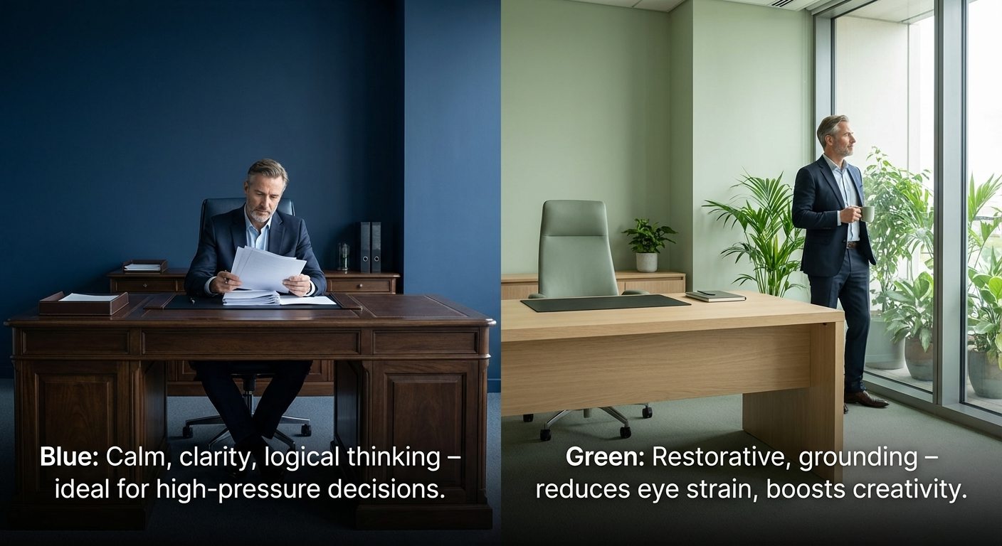
Blue environments have been shown to reduce stress and support mental endurance . A study from the University of British Columbia found that blue environments can increase productivity on detail-oriented tasks by up to 15% compared to red environments . Blue is associated with calm, clarity, and logical thinking, making it ideal for executive office furniture in spaces dedicated to deep concentration and high-pressure decision-making.
Best for: Private offices, conference rooms, financial and legal sectors.
Green: The Restorative Color
Green is the color most easily perceived by the human eye, which helps reduce eye strain during long work hours . Research shows that workers exposed to biophilic green elements report 20% higher creative output . Green spaces feel restorative and grounding, making them excellent for modern executive office environments where leaders spend extended periods.
Best for: Open-plan layouts, collaborative studios, wellness zones.
Yellow: The Creativity Spark
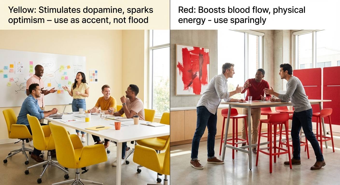
Yellow stimulates dopamine production, elevating mood and ideation frequency . It brings energy to a room by sparking optimism and enthusiasm . However, yellow requires careful handling—overuse can cause overstimulation or anxiety. Opt for softer, buttery yellows rather than harsh bright tones.
Best for: Brainstorming rooms, creative agencies, innovation hubs.
Red: The Energy Booster
Red elevates blood flow and heart rate, boosting performance on tasks requiring close attention and physical energy . It’s effective in collaborative or performance-based areas but should be used sparingly as it can lead to heightened emotions.
Best for: Collaborative zones, areas requiring high energy (sparingly).
Neutrals: The Professional Foundation
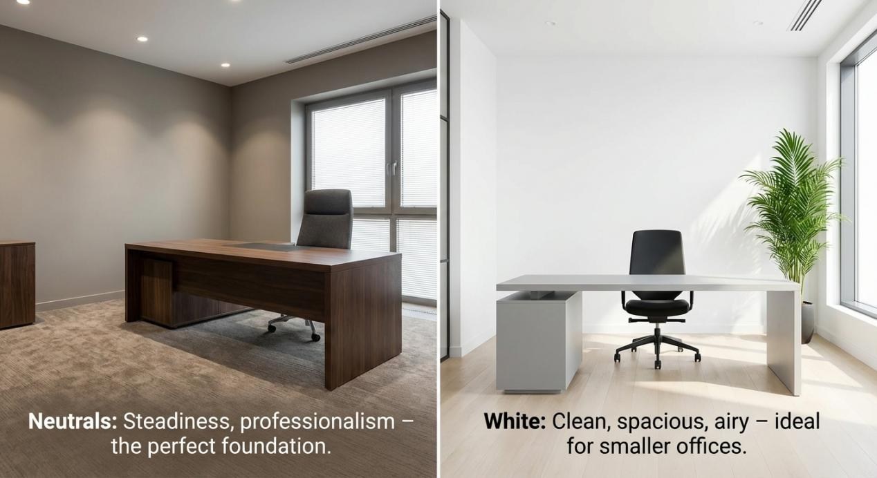
Neutrals like taupe, warm gray, beige, and charcoal convey steadiness and professionalism . However, heavy use of gray alone can suppress energy and contribute to fatigue. The most effective workplaces use neutrals as a base while pairing them with brighter hues in furniture and accents .
Best for: Executive suites, reception areas, client-facing spaces.
White: The Clean Slate
White conveys cleanliness and order . A white or light gray executive desk can make a smaller office feel more spacious and open, reflecting light and creating an airy atmosphere . However, too much stark white can feel sterile. Balance it with natural materials, warm lighting, and accent colors.
Best for: Small offices, design studios, tech startups.
Cultural Color Preferences Across Global Markets
When sourcing executive office furniture for multinational companies or offices in different regions, understanding cultural color preferences is crucial. Colors that convey authority in one country may feel inappropriate in another .
North American Market
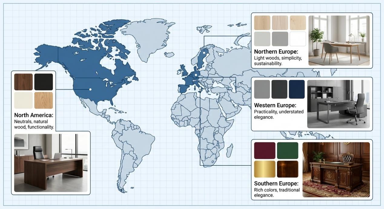
Dominant Preferences: North American consumers typically favor functionality and versatility in furniture design . The color palette tends to be neutral, with shades of brown, black, and white being widely accepted. Natural wood finishes are highly sought after for their warmth and authenticity.
Regional Nuances: In the United States, dark wood tones like walnut and mahogany are associated with traditional authority and stability. In Canada, there’s a growing preference for lighter, more sustainable materials that reflect environmental consciousness .
Design Aesthetic: Clean lines, simple shapes, and minimalist designs are highly valued, reflecting the preference for a clutter-free environment .
European Market
Europe’s rich cultural diversity creates distinct regional preferences :
Northern Europe (Scandinavia): Light-colored woods, minimal ornamentation, and a strong connection to nature dominate. The focus is on simplicity, functionality, and sustainability. Modern executive office designs in Sweden, Denmark, and Norway favor pale oak, ash, and birch with soft gray or white accents.
Southern Europe (Italy, France): There is a strong appreciation for traditional and ornate designs. Deep, rich colors like burgundy, forest green, and gold are prized. Credenzas with intricate details and luxurious materials such as marble tops are common in high-end executive spaces .
Western Europe (Germany, UK): Practicality meets understated elegance. Gray, charcoal, and navy blue are popular choices for corporate office furniture, conveying reliability and professionalism.
Asian Market
The Asian market is highly diverse, with different countries having their own unique cultural preferences :
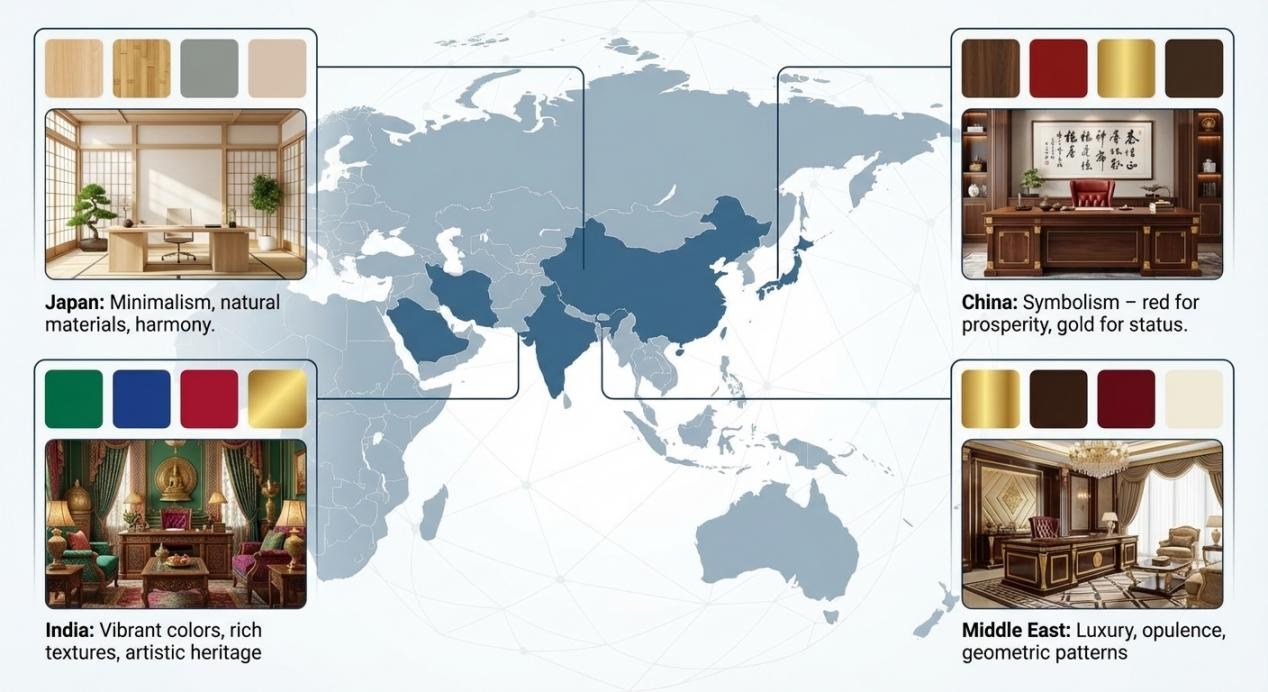
Japan: Minimalism and simplicity are deeply ingrained. Japanese design features clean lines, natural materials like bamboo and light wood, and a harmonious balance between form and function. The concept of “wa” (harmony) influences color choices toward soft, muted tones.
China: There is a preference for more elaborate and symbolic designs. Red symbolizes good fortune and prosperity, while deep browns and gold convey wealth and status. Traditional Chinese motifs may be incorporated into executive office furniture for cultural resonance.
India: Bright colors, detailed patterns, and rich textures are valued. Deep jewel tones like emerald, sapphire, and ruby appear in high-end furniture, reflecting India’s vibrant artistic heritage.
Middle Eastern Market
Distinct Characteristics: Islamic art and architecture influence design aesthetics with geometric patterns and arabesque designs . Rich, warm colors such as gold, red, and brown are prevalent, associated with luxury and opulence.
Scale and Presence: Executive office furniture in this region is often designed to be grand and imposing, with large sizes and high-quality materials that showcase wealth and status .
The 60-30-10 Rule for Executive Office Color Balance
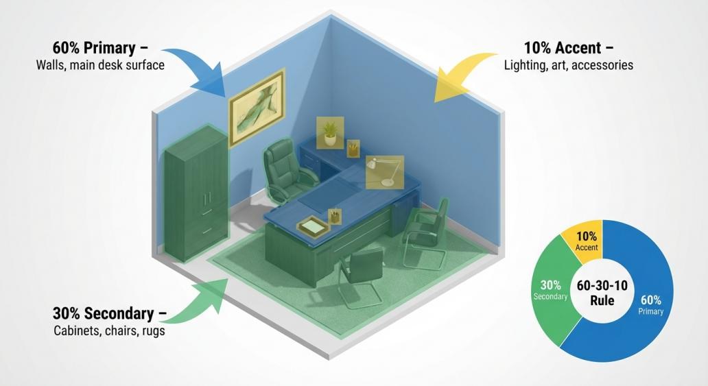
A common mistake in office design is an unbalanced color scheme that feels either chaotic or monotonous. The 60-30-10 rule is a proven framework for creating harmonious and visually appealing spaces :
- 60% Primary Color:The dominant, foundational hue covering largest surface areas—walls, flooring, and the main surface of your executive desk.
- 30% Secondary Color:Supports the primary hue and adds visual interest through secondary furniture like storage cabinets, accent walls, or area rugs.
- 10% Accent Color:The pop of color used sparingly for metallic trim, lighting fixtures, artwork, or small decor items.
Applying the Rule to Executive Office Furniture
| Palette Style | 60% Primary (Dominant) | 30% Secondary (Material) | 10% Accent (Highlight) |
| Monochromatic Power | Light Gray Walls | Charcoal Executive Desk & Dark Gray Chair | Black Metal Legs & Trim |
| High-Contrast Authority | Off-White Walls | Black Sintered Stone Executive Desk | Polished Chrome or Brass |
| Earthy Sophistication | Warm Greige Walls | Walnut Desk & Brown Leather Chair | Deep Green Plant & Bronze |
| Scandinavian Calm | White Walls | Light Oak Desk & Pale Gray Chair | Soft Blue Textiles |
| Asian Fusion | Neutral Beige | Dark Wood Credenza with Gold Accents | Red Lacquer Accessories |
Executive Desk Colors and Their Impact
The executive desk is the centerpiece of any leadership office. Its color sets the tone for the entire space .
Black and Dark Wood: The Authority Statement
A desk in black, charcoal, or deep espresso has long been a symbol of authority and sophistication . These colors minimize visual distractions, allowing the mind to settle into deep focus. Dark tones anchor a room, making it feel grounded and established.
Best for: Client-facing offices, law firms, financial institutions.
Practical Tip: Choose matte or low-sheen finishes. High-gloss surfaces can create distracting glare, contributing to visual fatigue according to OSHA guidelines .
Walnut and Oak: The Warmth of Approachability
Medium wood tones bring a natural, organic element into the office, creating warmth, stability, and approachability . A desk with visible wood grain connects us to nature, reducing stress and fostering well-being.
Best for: Collaborative leaders, home offices, creative industries.
Cultural Note: Walnut is highly prized in North America for its rich tones. In Scandinavia, light oak dominates. In China, darker woods with red undertones are preferred.
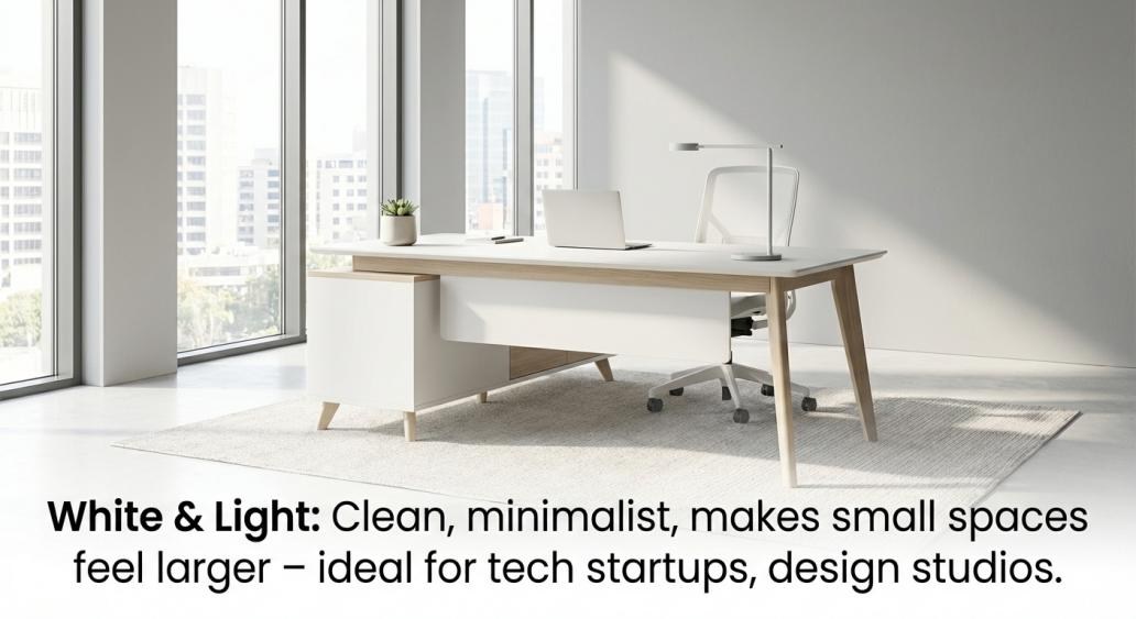
White and Light Finishes: Modern Clarity
White or light gray desks offer a clean, minimalist canvas . They make smaller offices feel larger and more open, reflecting light and creating an airy, uncluttered atmosphere. This sense of space translates into mental clarity.
Best for: Tech startups, design studios, smaller executive offices.
Practical Tip: Always opt for matte finishes to avoid glare .
Sintered Stone and Premium Materials
Materials like sintered stone offer unique textures and colors that combine luxury with durability . The Ark Pro L-Shaped Standing Desk with Lauren Black Gold sintered stone top merges authoritative black with luxurious texture, providing a glare-resistant surface perfect for executive workspaces.
Part 5: Beyond Color – Materials, Light, and Ergonomics
The Role of Material in Color Perception
Color doesn’t exist in a vacuum. The material it’s applied to dramatically affects its perceived character :
Wood Veneer: Brings inherent warmth and organic pattern. Natural walnut veneer on an executive office desk feels solid, reliable, and timeless.
Sintered Stone: Offers cool, matte finish that speaks to modern technology and industrial precision.
Metal Accents: The choice between matte black, brushed brass, or polished chrome can completely shift the mood.
The Critical Role of Lighting
A critical mistake many make is selecting colors from small swatches under store lighting . Colors look entirely different under natural morning light versus cool evening lamp light.
Practical Steps:
- Always test color and material samples in the actual space at different times of day
- Consider circadian-aligned LEDs—5000K in mornings for alertness, 2700K in afternoons for winding down
- Place samples next to flooring and wall finishes to see interactions
Ergonomics and Aesthetics in Harmony
There is a persistent myth that you must choose between beautiful executive office furniture and ergonomic function . Modern executive desks are engineered to be both stunning and highly functional, integrating advanced ergonomics without compromising style.
High-end standing desks now come in premium finishes like solid wood, sintered stone, and elegant veneers while housing powerful dual-motor lift systems . The “20-8-2” rule (20 minutes sitting, 8 minutes standing, 2 minutes moving) recommended by ergonomics experts is only possible with height-adjustable furniture .Practical Decision Framework
Questions to Ask Before Choosing Colors
- What is the primary function of this space?
- Deep focus work → Blues and greens
- Creative collaboration → Yellows and oranges
- Client meetings → Neutrals with strategic accents
- High-stress decision-making → Earthy grounding tones
- Who uses this space?
- Individual executive → Personal preferences matter most
- Team meetings → Consider group dynamics
- International visitors → Cultural sensitivity required
- What does your brand communicate?
- Conservative and stable → Traditional woods, navy, burgundy
- Innovative and forward-thinking → Clean whites, bold accents, mixed materials
- Sustainable and conscious → Natural materials, green accents, light woods
- What are the physical constraints?
- Small space → Lighter colors expand visually
- Limited natural light → Warm tones compensate
- Large space → Darker colors add intimacy
Executive Office Color Selection Checklist
- Define primary goal (focus/creativity/authority/warmth)
- Research cultural preferences of primary users/visitors
- Select primary color (60%) for walls and major furniture pieces
- Choose secondary color (30%) for supporting furniture
- Identify accent color (10%) for accessories and details
- Test all materials and colors in actual lighting conditions
- Verify ergonomic functionality of selected furniture
- Request sustainability certifications if required
- Consider long-term maintenance and durability
- Document color specifications for future procurement
Case Studies in Color Strategy
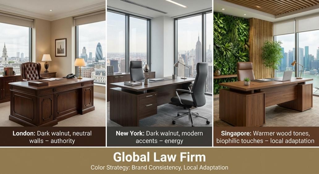
Case Study 1: Global Law Firm Headquarters
Challenge: A multinational law firm needed to furnish executive offices across London, New York, and Singapore while maintaining brand consistency and respecting cultural preferences.
Solution:
Primary palette: Dark walnut executive office furniture for authority and tradition
Secondary palette: Neutral cream walls and charcoal gray seating
Cultural adaptations: Warmer wood tones in Singapore, lighter accents in London
Result: Consistent brand identity with culturally appropriate variations; partner satisfaction scores increased by 28%.
Tech Startup Headquarters
Challenge: A fast-growing tech company wanted to attract young talent while maintaining professionalism for investor meetings.
Solution:
- Open plan: White desks with oak accents for clean, modern feel
- Executive offices: Gray walls with blue accent furniture for focus and calm
- Collaboration zones: Yellow and orange seating for energy and creativity
Result: Employee satisfaction improved by 35%; investor feedback highlighted the professional yet innovative atmosphere.
Middle Eastern Financial Institution
Challenge: A bank in Dubai needed executive offices that conveyed wealth, stability, and cultural authenticity.
Solution:
- Primary: Deep mahogany and gold-accented executive office furniture
- Secondary: Rich cream walls with Islamic geometric patterns
- Accent: Subtle green touches symbolizing prosperity
Result: Client confidence increased; the space was featured in regional design publications.
Future Trends in Executive Office Color
The Shift Toward Sustainability
Sustainability is no longer optional. By 2025, EU standards require 80% of office furniture to have recyclable or sustainable certifications . This drives demand for natural materials and low-VOC finishes that happen to align with biophilic color trends.
Biophilic Design Integration
Green-infused spaces are proven to reduce stress and boost creativity . Expect to see more integration of living walls, natural wood tones, and earth-inspired palettes in modern executive office design.
Personalization and Authenticity
Increasingly, companies allow employees to personalize their workspaces . For executive offices, this means curated art collections, signature color schemes, and furniture that reflects individual leadership style while maintaining professional standards.
Bold Accents as Strategic Tools
Rather than full-room color schemes, designers are using bold accents strategically—a cobalt blue filing cabinet in accounting departments for precision, burnt orange stools in oversight stations for energy .
Color as Strategic Investment
Choosing colors for executive office furniture is not merely aesthetic—it’s a strategic investment in productivity, brand perception, and employee well-being. Research shows that evidence-based color schemes can deliver up to 15:1 ROI through reduced absenteeism and 20% higher employee retention .
By understanding color psychology, respecting cultural preferences, applying the 60-30-10 rule, and balancing beauty with ergonomic function, you can create executive spaces that truly work—for the people who use them every day and for the organizations they represent.
About Misimu
At Misimu, we’ve been manufacturing high-quality executive office furniture for global clients for over 20 years, serving customers in 60 countries. Our collections feature premium wood veneers, PUR and laser edging technologies, and water-based finishes with GREENGUARD certification. We understand that color choices are deeply personal and culturally significant—and we’re here to help you make the right decision.
Contact us for:
- Custom color and material consultation
- Samples of our executive deskcollections
- Specification assistance for your next project
Appendix: Quick Reference Tables
Color Psychology Summary
| Color | Primary Effect | Best Applications | Productivity Impact |
| Blue | Calm, focus, clarity | Private offices, conference rooms | 15% higher detail task performance |
| Green | Restorative, balanced | Open plans, long-hour spaces | 20% higher creative output |
| Yellow | Creative, energetic | Brainstorming zones | 52% higher ideation frequency |
| Orange | Social, warm | Collaborative areas | 25% higher energy-intensive task performance |
| Neutrals | Professional, timeless | Executive suites | Foundational |
| Dark Wood | Authoritative, stable | Client-facing offices | Focus enhancement |
| Light Wood | Approachable, warm | Home offices, creative spaces | Stress reduction |
Cultural Color Preferences by Region
| Region | Dominant Preferences | Avoid |
| North America | Neutrals, natural wood, black, white | Overly bright colors in executive spaces |
| Northern Europe | Light woods, pale grays, whites | Dark, heavy colors |
| Southern Europe | Rich woods, burgundy, gold, green | Minimalist all-white |
| Japan | Light wood, muted tones, minimalism | Bright, clashing colors |
| China | Dark wood, red accents, gold | White (associated with mourning) |
| Middle East | Gold, deep browns, rich colors | Dull, lifeless tones |